Density Plot
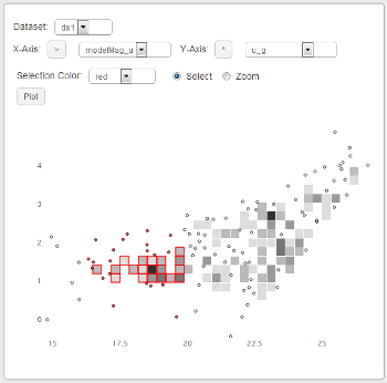
The density plot allows you to create a scatter plot from a data set consisting of a large number of points. After choosing a data set and an x and y axis, click the 'plot' button to display the data. The arrows next to the x and y axis dropdown boxes can be used to reverse the direction of the axes on the plot.
Concentrated areas of points are automatically binned to improve performance. This makes it possible to work with data sets with too many points to efficently be displayed by the Scatter Plot.
Selecting a bin selects all of the points within that region. If there are any points within a region that are selected, the entire bin will appear to be selected. Making a selection on the scatter plot updates the color of the selected points in the shared dataset.